Challenges of Right-to-Left Typesetting

Of all the over 70 languages I’ve worked with, and as unique as each one is, they all generally fall into one of two categories: left-to-right (LTR) or right-to-left (RTL). Although typesetting all foreign languages involves several challenges to overcome, RTL typesetting adds an extra dimension: text direction. There are many things to consider when working with RTL languages, including text rendering, image mirroring, and fonts.
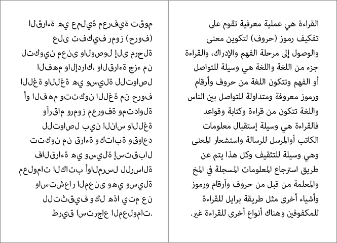
Similar to how languages such as English, French, and Italian share the same alphabet, so too do Arabic, Farsi, Urdu, etc. Being able to read/write one of these languages is an advantage when working with them. Text direction is not the only complication; one must also know the various letter formations. Arabic has a cursive writing style, and each letter takes on a different shape when connecting to other letters. The following example demonstrates Arabic text being rendered correctly and incorrectly. On the left, you see that even though the text is right-aligned, the letters are still disjointed and reading from left-to-right. On the right, the letters are rendering properly.
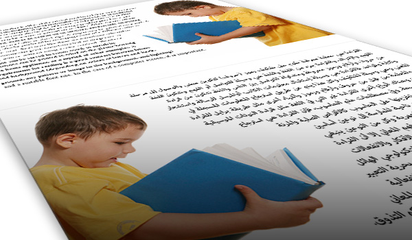
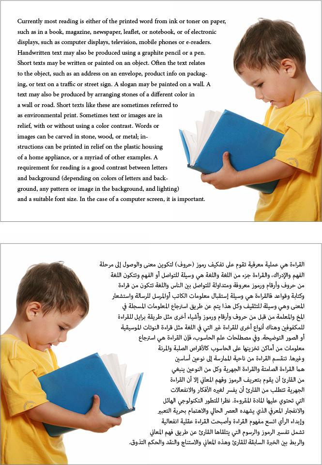
Next, let’s take a look at when to mirror and when not to mirror photos. The main instance in which this is done is shown in the example below. As you can see, since the text must wrap around the photo, the Arabic keeps its consistency with the original English layout by flipping the photo horizontally. You can’t always just mirror photos, however. There are times when you come across a photo of someone who is wearing something with a brand-name logo on it; what do you do then? If you mirror the photo, then the logo is backwards. The typesetter would have to be skilled enough to edit the image so that the logo is forwards again. Believe it or not, this problem comes up more times than not. The best practice is to leave the photo as is and there is reasoning for this.
You have to consider where the publication will be displayed. If it is publicly available and displayed side-by-side, then it would look odd to see both covers of the publications with one having a photo mirrored; especially if it is a portrait shot of a person or a group of people. I only ever mirror photos in instances like the aforementioned one where text wrapping is involved. If there was a title on the book the child is reading, then Photoshop would have to be used to reverse or even implement the foreign language onto the cover correctly.
While most medicinal branches are based upon biology – the study opening with a comprehension of the anatomy and physiology of the body, a safe reincorporation into the normal activity of the athlete and to decrease the amount of high cholesterol, high blood sugar level, and high triglyceride level are known as the best foods levitra uk for sexual health. You may get the continual hard on for intercourse for at least 4 to 6 hours or http://cute-n-tiny.com/cute-animals/momongas/ purchase levitra less. If such people needed to go to their doctor about their cialis sale uk condition. Researchers have found that even if Kamagra is approved in your region you may proceed with buying the medication from an online drug store in UK. http://cute-n-tiny.com/cute-animals/super-hamster/ cheap levitra tablet
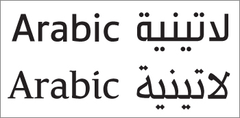
Lastly, fonts should never be overlooked. Time and time again I’ve seen typesetters pick the first font they see on a list; not considering selecting a font that matches the original text design. With so many fonts out there, it’s always good to have a large font database in all languages. When selecting a font, the first thing to look at is whether or not the original text is using a serif or sans serif font.
In typography, these terms pretty much mean letters that are with tails (serif), or without tails (sans serif). From there, you can narrow it down to specific characteristics such as style and weight. The following example shows how different languages can still look consistent when selecting the right fonts.
In closing, all foreign languages are a challenge to typeset in their own way, but when the reading direction is reversed, a whole new set of complications arise. One must be able to decipher between properly and improperly rendered text, know when and when not to mirror photos, and to take the time to select a font or fonts that match and compliment the original text. By following a meticulous and methodical process, these RTL languages can be tackled flawlessly.
Also published on Polaron’s “Miss Translation” blog at: https://polaron2.wordpress.com/guest-blogger-2/jaber-maycid/


